As I’ve done for the past few decades, I’m ending the year with a look back at some cultural highlights I found most fulfilling during the past 12 months:
-
Hitting the road with the kids:
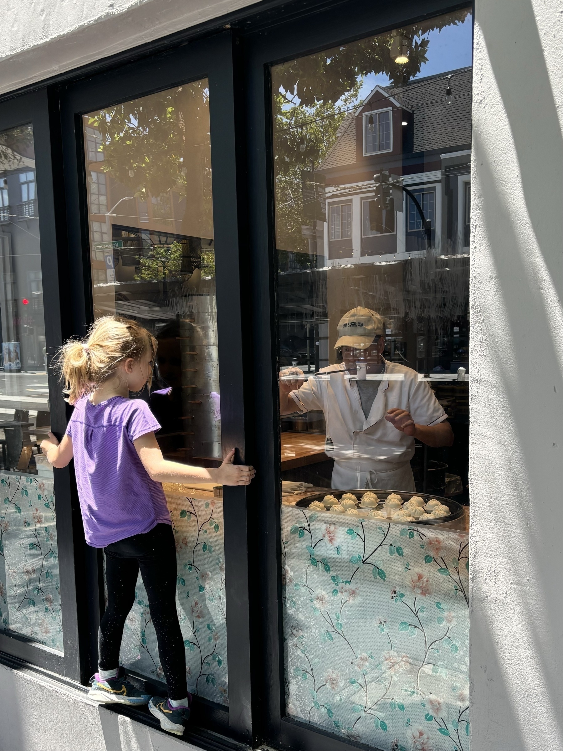
2024 was a special year for family travel — an early summer trip to stay with relatives in San Francisco (a moment from there above), then a late summer stay with my sister just outside of D.C. Muir Woods, Presidio Tunnel Tops, the de Young, the Glenstone, MLK Memorial, National Gallery, and so much more. Great ages for the kids to experience both. Fortunate to have been able to do it.
-
Nonfiction books: “The Country of the Blind: A Memoir at the End of Sight," by Andrew Leland; “The Vanity Fair Diaries: 1983 – 1992” by Tina Brown; “All Things Are Too Small: Essays in Praise of Excess” by Becca Rothfeld; “The Dawn of Everything: A New History of Humanity” by David Graeber and David Wengrow; “The Message” by Ta-Nehisi Coates; “Kafka: Diaries” (translated by Ross Benjamin); “To Fall in Love, Drink This” by Alice Ferring; “Lovely One: A Memoir” by Ketanji Brown Jackson; and “The Contagion Next Time” by Sandro Galea.
-
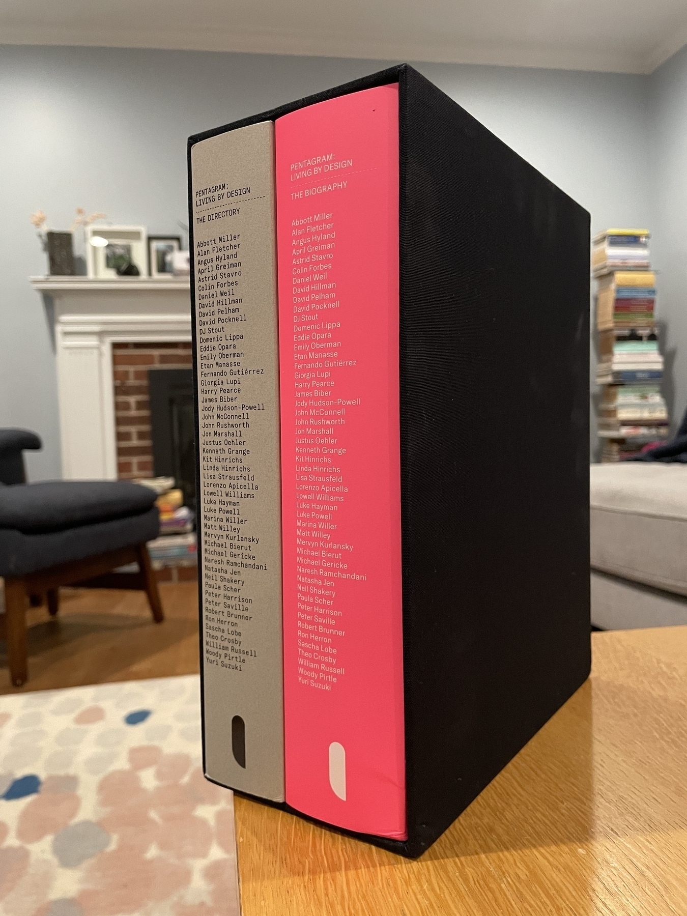
Chunky, visual-heavy nonfiction books: “The Look of the Book: Jackets, Covers, and Art at the Edges of Literature” by Peter Mendelsund and David J. Alworth; “The Work of Art: How Something Comes from Nothing” by Adam Moss (an exceptional editorial mind); “I. M. Pei: Life Is Architecture” by Shirley Surya; “The Wes Anderson Collection” by Matt Zoller Seitz; “Branding: In Five and a Half Steps” by Michael Johnson; “How Design Makes Us Think and Feel and Do Things” by Sean Adams; and “Crossing the Line: Arthur Ashe at the 1968 US Open” (multiple editors/writers).
-
Novels: “The Fraud” by Zadie Smith; “Nonfiction” by Julie Myerson; “Intermezzo” by Sally Rooney; and “Catalina” by Karla Cornejo Villavicencio.
-
Books of poems: “Scattered Snows, to the North” by Carl Phillips and “A Film in Which I Play Everyone” by Mary Jo Bang, both STL-connected writers.
-
Books about what went wrong at Twitter: I should not have spent time reading two books on this subject, but they were interesting: “Battle for the Bird” by Kurt Wagner and “Character Limit: How Elon Musk Destroyed Twitter” by Kate Conger and Ryan Mac.
-
Rereading “Gilead”: Endures. Recommended for when you’ve just read two books about Twitter.
-
The William Gass Centenary: I spent many years writing about and promoting awareness and discussion of Bill’s work, and I had the great fortune of getting to know both Bill and Mary during the last decade of his long and productive life. In October, WashU organized a day-long event to mark what would have been Bill’s 100th birthday. While the Gass projects I launched over the years are set on a kind of permanent simmer, it was meaningful to re-immerse myself in the world of Bill’s writing. Videos and resources are available on the university’s centenary website.
-
Movies: I was deeply impressed and moved by “The Zone of Interest”; “The Taste of Things”; “Past Lives”; “Anatomy of a Fall”; “Petite Maman”; “Saint Omer”; “Aftersun”; and “His Three Daughters.” Also enjoyed “Killers of the Flower Moon”; “American Fiction”; “You Hurt My Feelings”; “Between the Temples”; “May December”; “Barbie”; “Oppenheimer”; “Maestro”; “Janet Planet”; “She Said”; “Showing Up”; “BlackBerry”; and “Dumb Money.” Temporarily engrossing: “Conclave.” Interesting docs: “Modernism, Inc.: The Eliot Noyes Design Story”; “Martha.”
-
Satisfying rewatches: “Marriage Story”; “Heat”; and “Kicking and Screaming” (prompted by The Rewatchables). Plus, with the kids, “Spellbound” and “The Princess Bride.”
-
Articles about the world: “Seventy Miles in the Darién Gap” by Caitlin Dickerson, The Atlantic; “Our Strange New Way of Witnessing Natural Disasters," by Brooke Jarvis, NYT Magazine; “The Forgotten History of Hitler’s Establishment Enablers,” by Adam Gopnik, The New Yorker; and “Unsafe Passage: A Palestinian Poet’s Perilious Journey Out of Gaza,” by Mosab Abu Toha, The New Yorker.
-
Articles about America: “What Will Become of American Civilization?" by George Packer, The Atlantic; “The Golden Age of American Jews Is Ending,” by Franklin Foer, The Atlantic; “The Man Who Died for the Liberal Arts," by David M. Shribman, The Atlantic; and “Shibboleth” by Zadie Smith, The New Yorker.
-
Personal essays: “On Cancer and Desire," by Annie Ernaux, The New Yorker; “The Birth of My Daughter, the Death of My Marriage” by Leslie Jamison, The New Yorker; “If My Dying Daughter Could Face Her Mortality, Why Couldn’t the Rest of Us?" by Sarah Wildman, NYT; and “Variations on the Theme of Silence," by my friend Jeannette Cooperman, The Common Reader.
-
Great match of medium and story: “She Slept With a Violin on Her Pillow. Her Dreams Came True in Italy," by Valeriya Safronova, with photographs and video by Sasha Arutyunova, NYT; “How Taylor Tomlinson Nailed Her Closing Joke," by Jason Zinoman, NYT.
-
TV shows: The show that made me smile the most all year was “Girls5Eva” (all seasons are streaming on Netflix). Huge fan as well of “Beef”; “The Bear” seasons 1 and 2; “Ripley”; “My Brilliant Friend” season 1; and “Fargo” season 5. Enjoyed “Magpie Murders” and “Bad Monkey.”
-
New Music: “Oh Smokey” from Clem Snide; “Manning Fireworks” from MJ Lenderman; “Charm” from Clairo; “Patterns in Repeat” from Laura Marling; “Hit Me Hard and Soft” from Billie Eilish; and “Chromakopia” from Tyler, The Creator. Doechii’s Tiny Desk performance was fierce.
-
New podcasts: My favorite new-to-me podcast this year was Talk Easy with Sam Fragoso. The host is wise beyond is years, does superb research and prep, and seems to quietly relish his good fortune of gently steering weighty conversations. (You can’t go wrong choosing an episode, but Fragoso’s conversation with Ocean Vuong was especially memorable, particularly for the author’s insights about youth and masculinity in America.) Another new discovery I enjoyed, as a former magazine EIC, was Print is Dead (Long Live Print). I can’t remember if I discovered it last year or this year, but I enjoy Jarrett Fuller’s Scratching the Surface podcast (as well as his blog).
-
A few podcast episodes: Bonnie Prince Billy talks through “I See a Darkness” on Life of a Record; The Wolf of Wine decodes his single “Quintin Tarantino”; Zadie Smith talks through “The Fraud” on Fresh Air; and the Dissect hip-hop aficionados talk through the Best Bars of 2024.
-
Connecting with two living artists: Any year when my wife Tamara presents a new exhibition is a good one, and this year saw her open “Delcy Morelos: Interwoven," at the Pulitzer Arts Foundation. Having our kids meet the Colombian artist, and hearing her talk astutely about her work, were highlights from the year. Grateful as well to meet Julie Blackmon, one of my favorite living photographers, and hear her discuss her distinctive Midwestern work at the Saint Louis Art Museum (thanks for the invite, JF).
-
Home tour with Laura Dewe Mathews: I have such admiration for Matt Gibberd and what he’s built with The Modern House — from the real estate listing website to the Homing In podcast to the publications, each one presented handsomely and with soul. In the summer, Matt shared a video interview and tour he did with architect Laura Dewe Mathews. I was thinking back to this one in particular, because Mathews' lovely home is known locally as “the gingerbread house” — and our kids are asking to begin nibbling away at theirs.
With that, sending best wishes to you in the new year.