Case study: How to name and introduce a $3,600 keyboard in words, pictures, and video. (Via Andrew Wilkinson)
branding
“Studio Culture Now”
9/9/24
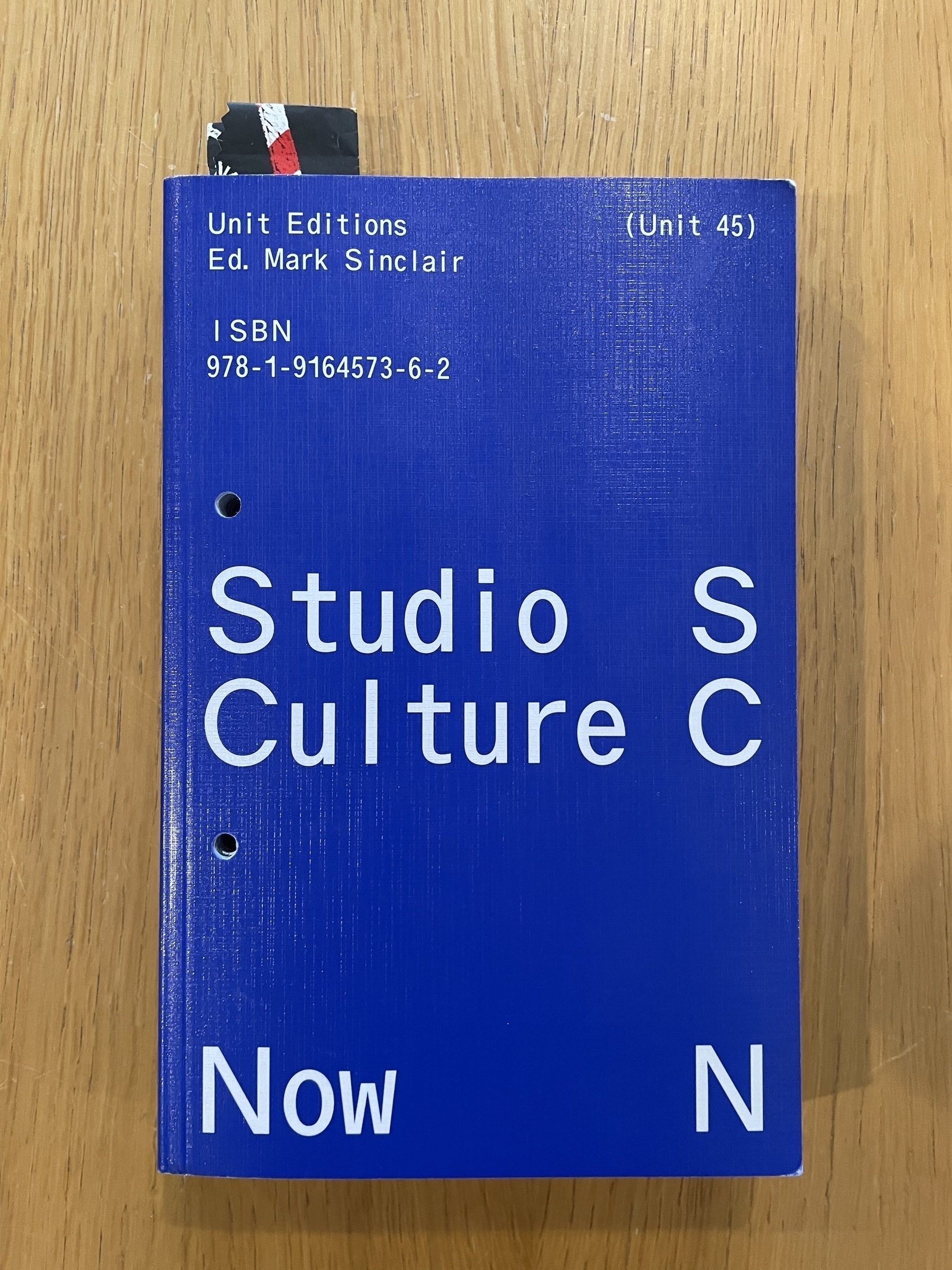
Paging back through the Kickstarter-backed “Studio Culture Now” from Unit Editions and realized I neglected to note it here. It’s an enjoyable volume featuring indie design studio heads talking shop. A few themes:
- There’s freedom in staying small.
- Having a nice workspace is a plus, but too much overhead’s a crusher.
- Output matters, but so does process, leadership, and owning your POV.
- Social posts and basic PDFs can aid business development more than a high-maintenance, glacially updated website.
- You can find success based anywhere, but be engaged with the field and your community.
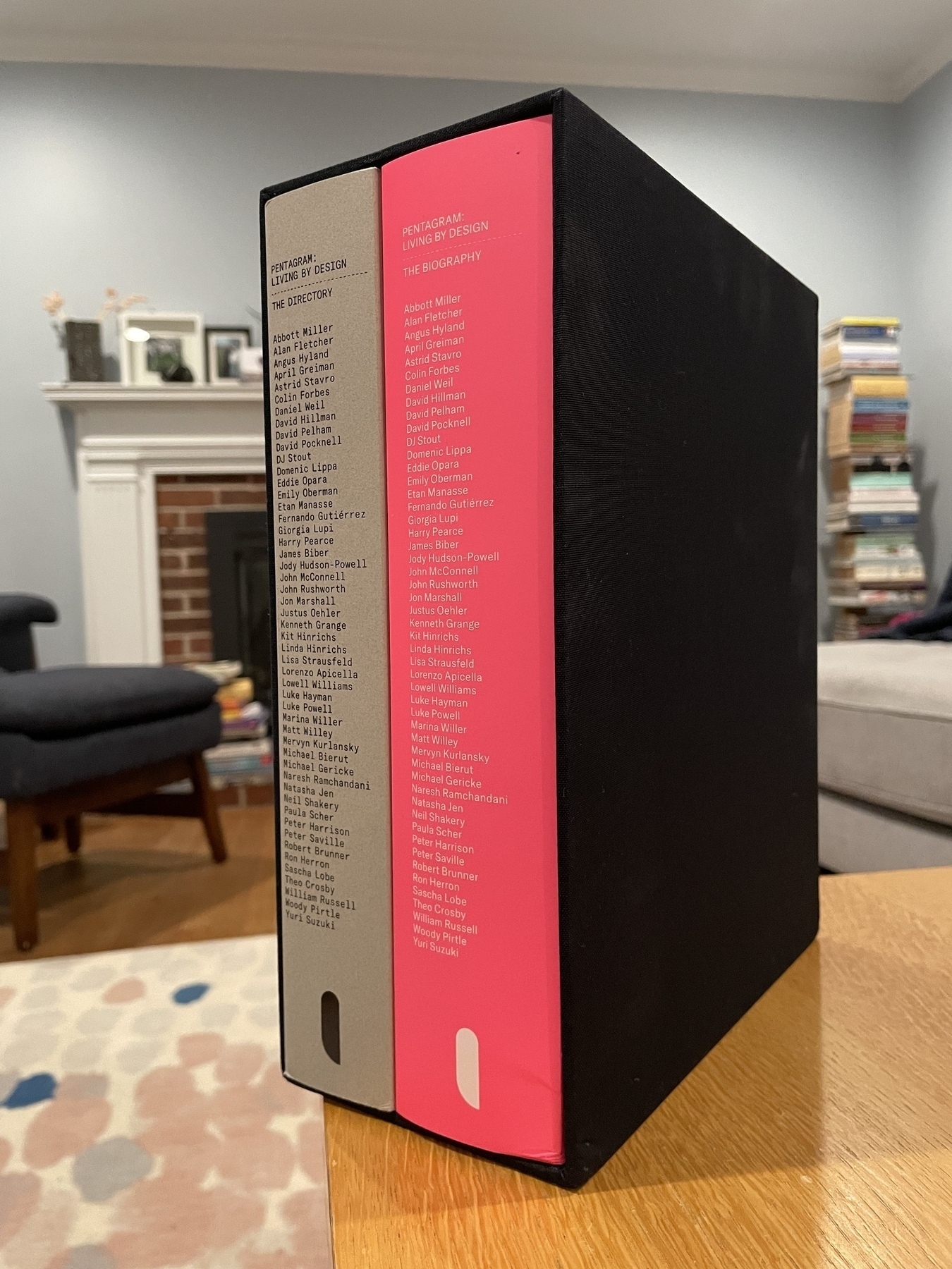
“Pentagram: Living by Design,” the exquisite-looking 50-year history of the iconic design studio, has landed at my house. Published by United Editions. Can’t wait.

Nice detail from Emily Heyward’s “Obsessed: Building a Brand People Love from Day One”, which I enjoyed: When her Red Antler agency helped develop a brand for home essentials company Snowe, the team photographed the line of pillows — soft, medium, and firm — with a potted plant atop each one, to demonstrate the amount of give. Clever and useful.
Since Michael Bierut stepped away from co-hosting the DBBD podcast, I’ve been missing audio access to his insights and opinions. I was excited to learn tonight of a new 90-minute+ interview with Bierut on the Time Sensitive Podcast. Eager to dig in.
(Relatedly, I was bummed to have juuust missed the chance to purchase one of only 1,000 copies of Unit Edition’s special two-volume book on Pentagram’s first 50 years. It sold out in 72 hours — good for them. The folks there had told me a few weeks ago there were no plans to reprint, but the page today makes it seem like they might be rethinking that, based on interest. I really enjoyed their “Studio Culture Now” and have my fingers crossed they’ll print some more of the Pentagram book.)
Agency work, without the ta-da
10/15/22
While there may be a scenario where this approach isn’t ideal, I appreciated these quotes (respectively) from Highdive’s co-founders and co-chief creative officers Chad Brodie and Mark Gross, published in the current CommArts:
[Chief marketing officers] like to work with us because we’re very keen on removing the ‘ta-da’ movement. Traditionally, an agency would get briefed, go away for a while and come back with one shiny campaign. That’s not our style at all. We like to bring our clients in early and often. We leverage their expertise, they’re brand experts who live and breathe the brand 24/7. We aren’t going to pretend like we understand their brand better than they do. We keep them in the process every step of the way.
When clients come in for a creative presentation, we’ll have the entire strategy laid out on the wall. It’s very much a work session, and that leads into the work.
The US Open with Sagi Haviv — A Change Of Brand: An enjoyable episode of what’s become one of my favorite podcasts. Interesting to hear how confidently (and, ultimately, triumphantly) the experienced Haviv answered a prospective client’s unreasonable request.
“Knowing Wink”
8/28/22
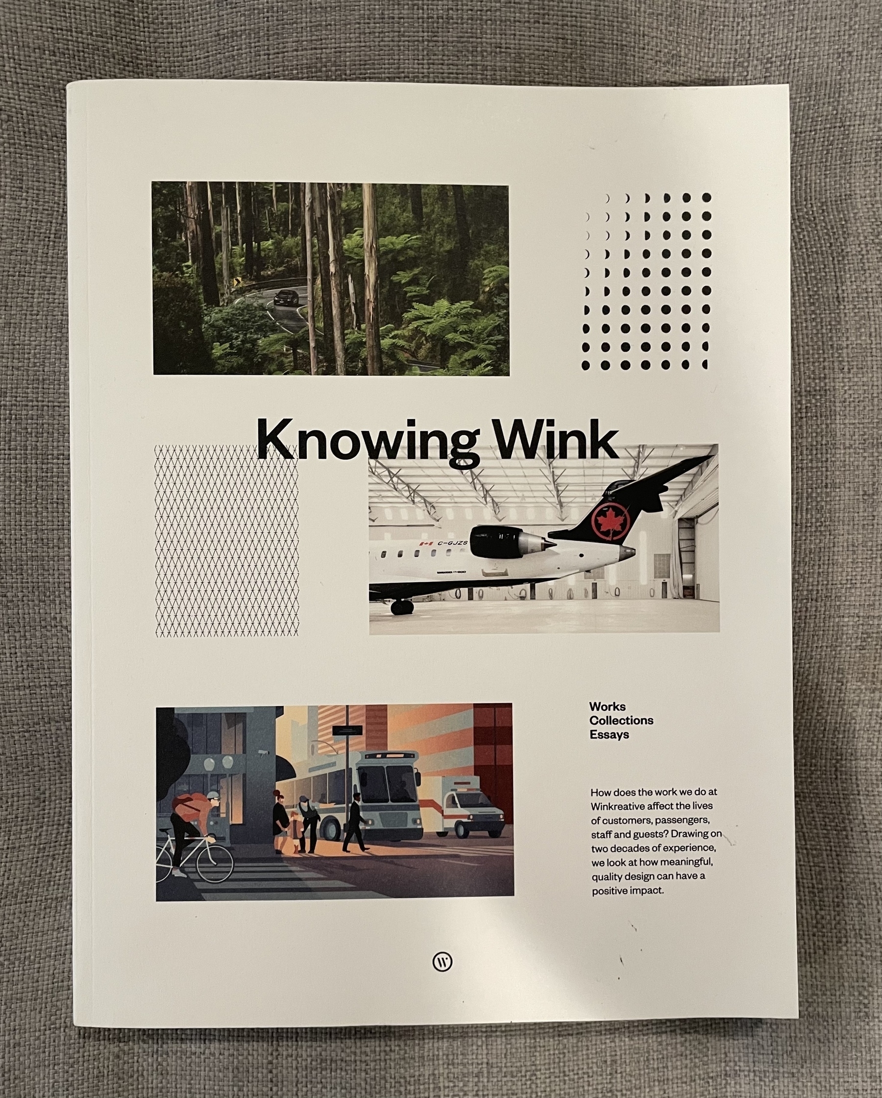
Being a decade-long Monocle subscriber and a fan of exploring how agencies document their work, I was happy to get my hands on Knowing Wink, first published in 2018 by Winkreative, the media org’s sister agency. Turns out it was as easy as sending them a nice email and asking how I could order it; they popped one in the mail with thanks for the interest. The chunky, nice-to-the-touch volume highlights 20 years of work from the boutique firm. Smart, crisply designed work confidently presented.
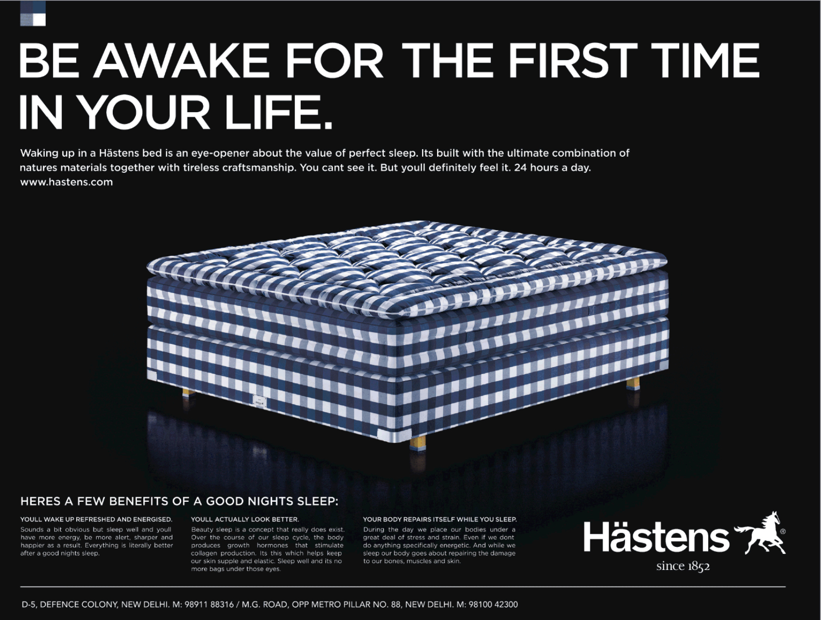
Still impressed with this luxury mattress company’s choice of positioning: Let’s not lead with sleep — let’s lead with what it leads to.
Abbott Miller on the "Content-Based Studio"
2/4/18
From the intelligent and beautifully made monograph Abbott Miller: Design and Content, which I devoured in early January, here is the designer/writer talking about the firm Design Writing Research, which he co-founded with Ellen Lupton:
During this time [perhaps mid-1990s], DWR moved from its basis in small print-based projects to exhibitions and publications. We elaborated our position as a hybrid of think thank, publisher, and design studio. The goal was to fuse our work as designers and writers, creating a studio that could generate content and use the unique skill set of designers to focus on projects about art, design, architecture, and ideas. In this notion of the content-based studio there were a number of inspirational precedents, from Charles and Ray Eames to Quentin Fiore and Bernard Rudofsky.
Our original emphasis on language and theory merged with work for clients who came to us not so much for the manifesto-like pronouncements of our mission, but for the thoughtful interplay of design and content in our projects. DWR was a self-consciously literary and conceptual hothouse version of a design studio, undertaking projects that experimented with literary theory and psychoanalysis, leaning heavily on what we saw as the vastly underdeveloped relationship between writing and graphic design. We borrowed from Jacques Derrida an expanded notion of "writing" (écriture), which included all elements of graphic communication, from symbols to spacing. Hence our predilection for mazes of glyphs, our attentiveness to the minutiae of punctuation and our maniacal focus on typography and textural systems.
Upcoming Talk: "Refreshing the Forest Park Forever Brand"
2/12/17
I'm pleased to be speaking to the St. Louis chapter of the International Association of Business Communicators on February 23 about the refreshed messaging and identity platform my team introduced for Forest Park Forever in 2015.
Michael Bierut on Honesty, Taste & Intelligence
12/31/16
I loved this book: a visually rich and smartly narrated collection of case studies exploring all parts of creative communications (logos, naming, typography, photography, illustration, messaging, client presentations…).
Bierut is an intelligent thinker and a terrific, crisp writer (beyond his obvious world-class design chops). Yet he knows the readerly pleasure in having an accomplished instructor (recall the book’s title) chronicle his own missteps en route to delivering a gem.
Here’s a passage I underlined and circled, a lead-in to a section on logotypes and symbols:
Everyone tends to get overly excited about logos. If you’re a company, communicating with honesty, taste and intelligence is hard work, requiring constant attention day after day. Designing a logo, on the other hand, is an exercise with a beginning and an end. Clients know what to budget for it, and designers know what to charge for it. So designers and clients often substitute the easy fix of the logo for the subtler challenge of being smart. When we look at a well-known logo, what we perceive isn’t just a word or an image or an abstract form, but a world of associations that have accrued over time. As a result, people forget that a brand-new logo seldom means a thing. It is an empty vessel awaiting the meaning that will be poured into it by history and experience. The best thing a designer can do is make that vessel the right shape for what it’s going to hold.